As Grey-Bruce continues to emerge from the COVID-19 pandemic, the area’s Public Health Unit is thrilled to announce that it will be breathing new life into its corporate brand identity.

The Grey Bruce Health Unit will now be known as Grey Bruce Public Health to better reflect its mission, on-the-ground work in the community, and collective passion – protecting and promoting public health in Grey-Bruce.
Grey Bruce Public Health is also launching a new logo that features an artistic interpretation of the Grey-Bruce region, with its highly recognizable coastline along Lake Huron and Georgian Bay.
This element is surrounded by a hexagon, which represents the esoteric balance of nature. Historically, hexagons have been used in symbology to represent changes for the long-term good, health, strength, and the potential for unity and healing.
The hexagon surrounding the Grey-Bruce region also indicates protection – a key part of Public Health’s mission and purpose.
“Brand identity is a big part of modern communications and is key to aligning our organizational values with how we’re perceived in the mind’s eye of the public and the partners we interact with,” says Grey Bruce Health Unit Communications Coordinator and creator of the new brand, Nelson Phillips.
“This new look and outlook on the promotion of health represent a fresh start we feel is going to positively influence our community partners, staff, and the community. After a massive cultural shift like we’ve seen happen with COVID-19, sometimes a fresh perspective and look can open doors to new ideas and new ways of making change.”
The rebranding process comes as Public Health continues to lead the region in the “recovery phase” of the emergency management process by reinstating its programs and services while incorporating the lessons learned during the emergency response, to renew its path moving forward to the future.
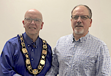
Newly elected Chair of the Grey Bruce Board of Health, Alan Barfoot, believes the rebranding has come at an ideal time, benefitting from public health authorities across the globe having the eye and ears of the general public like never before.
“I think the new look will serve the health unit very well for years to come and will help to usher in a refreshed perspective of our local public health unit… At first glance you obviously see Bruce Grey, both counties – I think it looks good and I look forward to seeing it roll out,” says Barfoot.
“I believe Nelson’s work on the new visual identity for Public Health and the branding campaign captures our vision to advance our organization on the road to the Centre of Excellence for Rural Public Health to better the health of the communities in Grey-Bruce and beyond for years to come,” says Grey Bruce Medical Officer of Health, Dr. Ian Arra.
“Nelson single-handedly has designed and led the campaign in-house saving us the need for external experts. The health unit is well served by his expertise that would overshadow many of the external firms we could have dreamed of contracting.”
The campaign has been developed completely in-house, without the need for an external consultant or additional funding. The process has also been transparent – another key value of Public Health – with regular updates both internally and externally through the Grey Bruce Board of Health. The goal has been to reimagine and deploy a brand that embodies Grey Bruce Public Health’s pride in supporting and protecting community health.
With the name change also comes a new acronym – GBPH – which addresses confusion between Public Health and other organizations that shared very similar acronyms.


